This tutorial uses both Adobe Photoshop and Adobe Illustrator and is probably most handy for screen printing companies. That is where I learned the technique after all.
In traditional screen printing it’s best to use vector art for printing spot color films (which are used to burn the screens). Vector art is crisp, you can easily set your spot colors, and the outcome is beautiful. However, for anyone who’s worked in the industry you know that customers don’t always provide the best art.
In fact, sometimes their art is downright atrocious!
This quick, handy technique will show you how to take a single or multi-color raster image and format it into a single color that can be edited in Adobe Illustrator.
It works especially well for sponsor logos! Many sports teams, big events, and other organizations request to have sponsor logos printed on their t-shirts, however the sponsors don’t always provide the correct art format. Mainly it’s because your typical person often doesn’t understand the difference between a raster image and a vector image so they’ll provide a simple full color JPG of their logo and be done with it (if you’re lucky it’s hi-res). For a screen printing artist that can be frustrating, especially if you’re expected to turn the logos into a single color for printing.
Now, again, this technique works on multi-color logos, however the final result is a 1 color print. If your customer needs full color sponsor logos printed then your best bet is to:
- Badger the client until they provide the proper format (annoying).
- Redraw the logo in a vector format yourself, or farm it out (costs more).
- Contact the sponsor company yourself for the correct format (takes time).
Anyway, if you’re looking to print a slew of sponsor logos or any other type of logo in a single color and all you have is a raster image than this is the tutorial for you.
Step 1. Secure the highest resolution raster image possible (300 DPI+ recommended, but not required) and open it in Adobe Photoshop. For this tutorial I am using the Bows & Bruises logo I designed for a friend.

Step 2. Under Image, Mode, select GRAYSCALE.
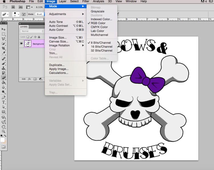
If this window pops up, click discard (you can check don’t show again to keep it from happening in the future).

Your logo should now be in grayscale (black & white).
Step 3. Go back to Image, Mode, then select BITMAP.

The Bitmap box opens up and this is where you have some choices. First, check your output. It’s best to match the input, however I recommend upping it to at least 300 DPI (you can test multiple versions to find the best outcome).

Second, under method you’ll see a few different choices. You can play around with which one provides the best outcome based on your logo and print/image needs. For this tutorial, I am going to show you both Diffusion Dither and 50% Threshold so you can see the difference.

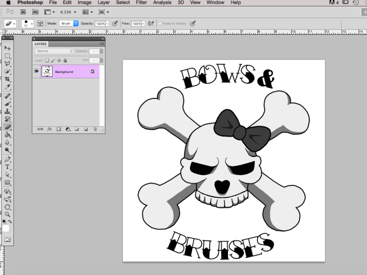
After I select Diffusion Dither and hit OK this is what my logo looks like. It pretty much hasn’t changed, however that’s not always the case so don’t think you’ve done something wrong if yours altered.
Now, when I select 50% Threshold and hit OK this is what my image looks like. You can tell right away that the outcome is different.

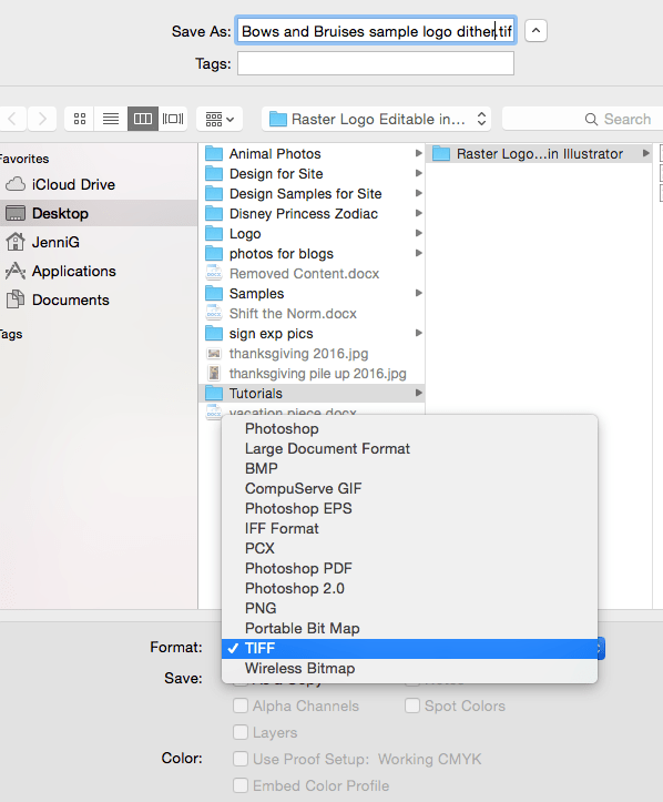
Step 4. Either way, now we need to save the image as a TIFF file. Select File, SAVE AS.
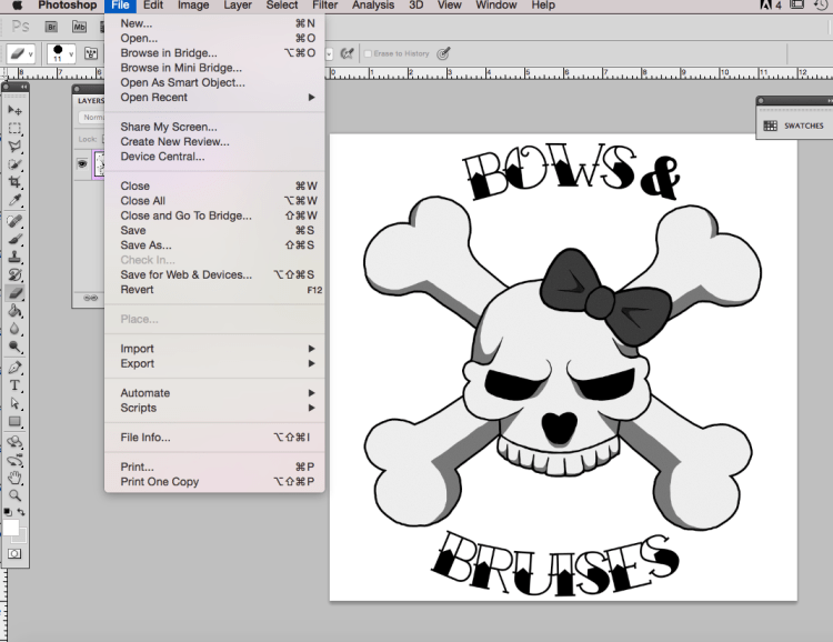

Then, make sure the format is set to TIFF and save the image wherever you choose.
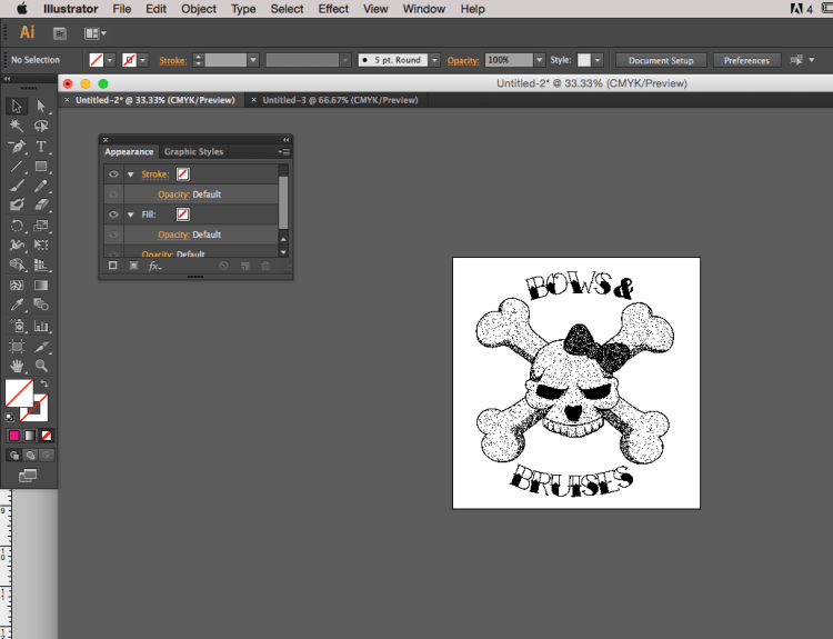
Step 5. Open your image in Adobe Illustrator and you’ll find it’s got a transparent background (my logos are on art boards hence the white). They also may look a little funky – that’s okay! This isn’t necessarily what your final image is going to look like, it’s just how Illustrator processes it.
This is the Diffusion Dither image.
This is the 50% Threshold image.

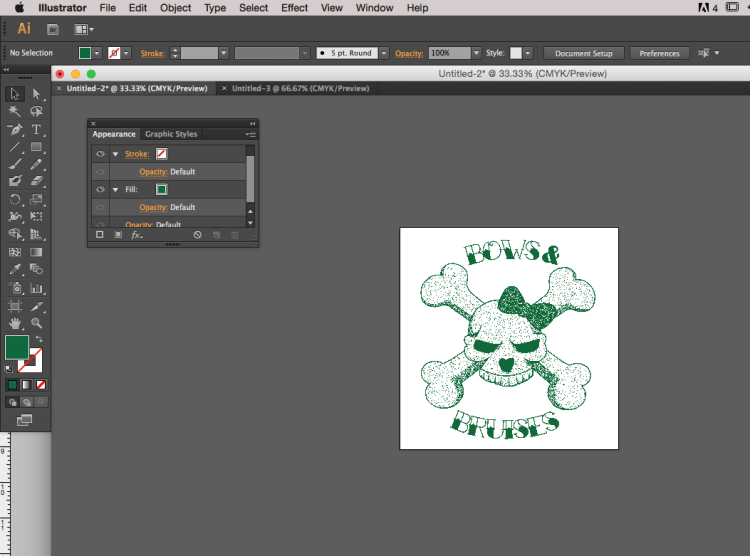
Step 6. Change the fill color. Pick whatever swatch, spot, or other color that you choose and BAM! You can easily set your logos all to the same spot color for printing on films.
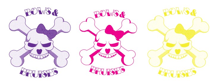
Diffusion Dither in red. You can see it’s still not technically ‘vector’ but the color changes.

Diffusion Dither in green.
50% Threshold in Pink.

Now, if you want to get an idea of what your printed or final logo is going to look like you can check it out via the Save For Web tool. On my Mac the shortcut is shift + option + command + S but you can also access Save For Web under File.
Diffusion Dither Final (in green). This version will print halftones.

50% Threshold Final (in black). This version is crisp and clean with no halftones.

There you have it. It’s simple, quick, and effective to take a raster image and make it into a single color image that’s editable in Adobe Illustrator. Play around with the Photoshop options until you find a combination that works best for you!
Have questions? Let me know in the comments and I’ll answer them as best I can.

Hi I have done a logo, and an image I have used in it has many colours the file size Ive done it on is 30×30 cm and 300dpi done in PS. I need to scale the image up a lot without losing any quality or it pixilating just wondered how to do that.
Would be grateful for your advice.
Thanks
LikeLike
Hello Dawn! Gosh, I wish I could be more helpful, but if you’re working with a raster image there’s not a whole lot you can do scale-wise without pixilating the design. Is it something you can turn into a vector image? Please feel free to email me your original art file (theladyjenji@gmail.com) and I’ll look at this for you. I don’t mind 🙂
LikeLike
Thank you! Very helpful ❤
LikeLike